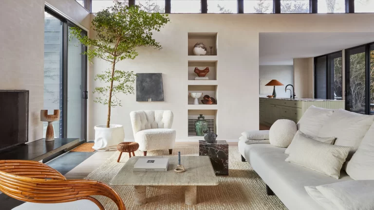
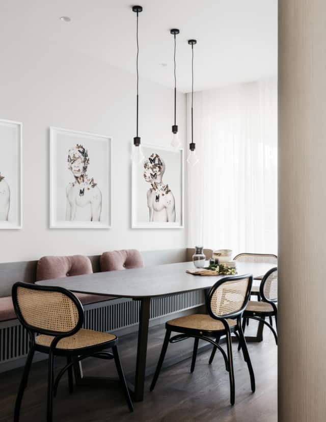
Neutral tones are the preferred choice of great fashion designers, architects, and interior designers. A neutral color scheme is an invaluable resource when working with color and designing. From clothing to textile prints and interiors, it is the basis for any interior design style.
Being meticulous, only those completely achromatic shades, lacking any trace of pure color, would belong to this classification. Based on this, we would find white, grey -in its different intensities- and black. Does this mean that they are the only neutral tones that exist? Not by a long shot. By using color mixing, we can obtain a complete variety of shades with a series of common characteristics that make them an attractive choice for interiors.

Made up of a wide range of colors
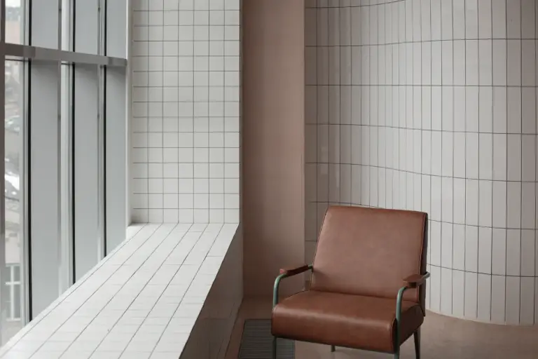
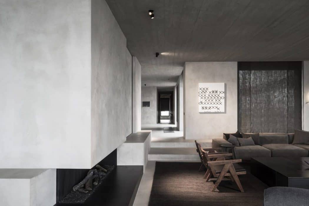
Combining the reduced selection of achromatic tones (white, grey, and black) with small proportions of pure colors, we can obtain a wide range of neutral tones. Colors such as beige or mink; terracotta reds; elegant greys such as pearls; deep aubergines, and a great variety of greens, browns, and grey blues, work perfectly as neutral tones. Remaining at low saturation levels, they do not exert a notable influence on other colors nor on the objects that surround them. Hence, they’re perfect to use as a background.
Suitable for any Interior Design style
The versatility of the range of neutrals is not only limited to their ability to combine with other colors, but also match flawlessly with any style of interior design. Whether you are passionate about the most minimalist lines, rustic style, vintage, or ambiances with a strong industrial or eclectic character. The right neutral tone will help to enhance the overall decoration and will make its most unique elements shine.
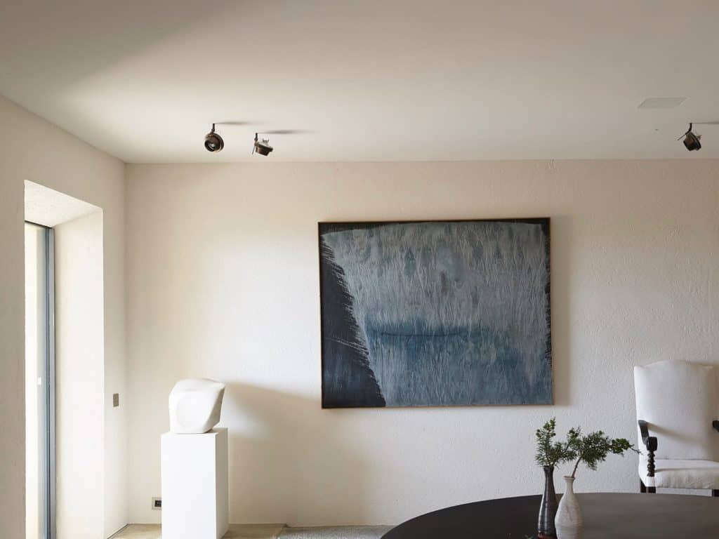
White is still king…
An excellent example of this versatility and the ease with which neutral tones can be combined with any other color and any style is white. White is, to this day, the most used when it comes to home decoration. It is the color that brings more light and helps to give a greater sensation of amplitude to the spaces. This feeling is something that can also be achieved with a great variety of neutral tones, especially with soft greys and browns. Besides, they help to reduce part of the coldness that the white ranges always provide, favoring the creation of a more welcoming space. Remember that neutral is not synonymous with white or light tone, and by adding small counterpoints that provide luminosity and contrast, a bold and exciting space can be achieved.